
The ‘History’ Page
On this page, you can view several graphs for each day, each showing a different aspect of your home’s energy consumption and production. Tap any graph to see more details:
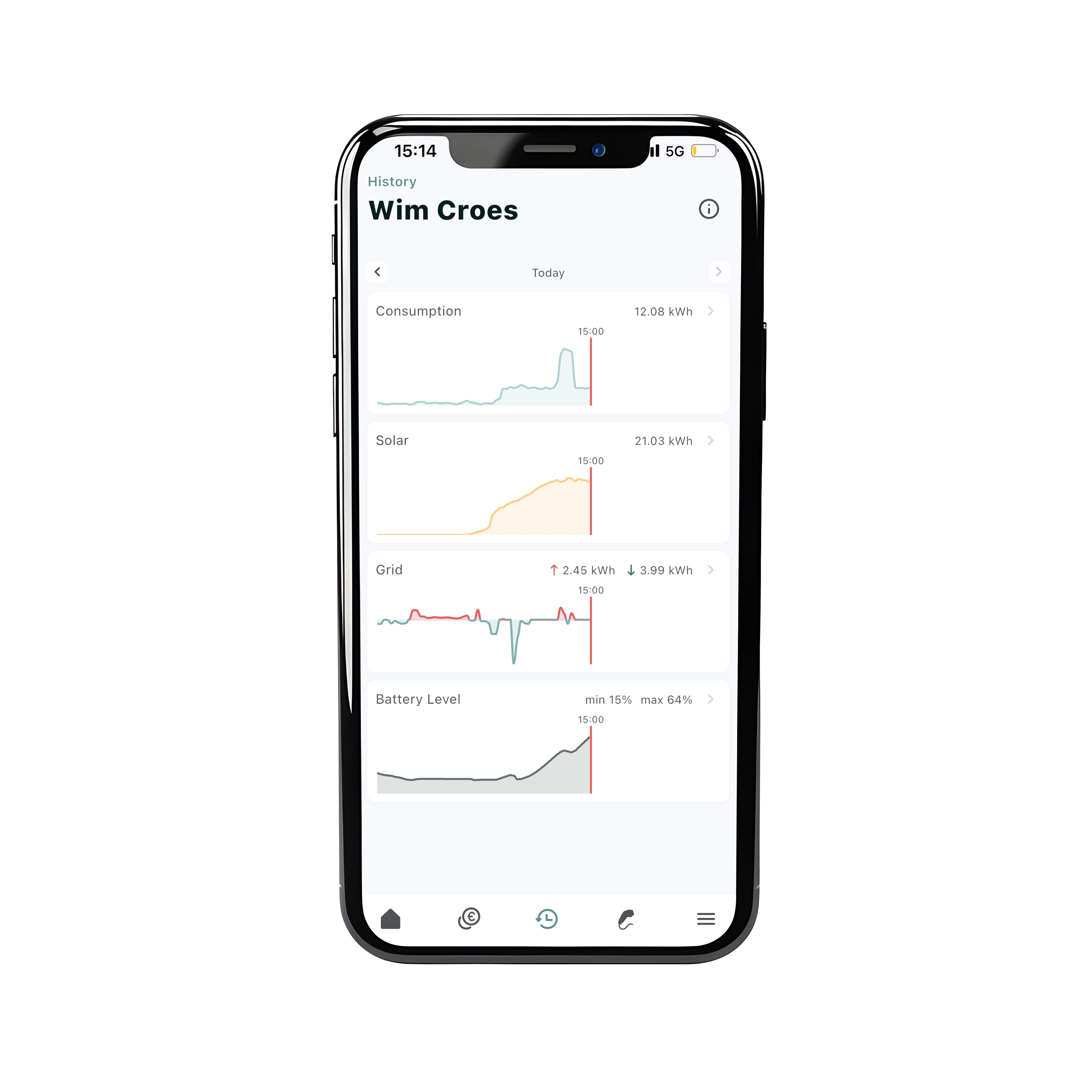
By default, the app shows today's data. If you want to view a different day or period, tap "Today" and navigate to the desired date:

Consumption graphs
This graph shows how much electricity your home has used throughout the day. At the top, you’ll also see the total consumption for that day. More detailed information
Solar graphs
This graph displays how much solar energy your panels have generated, as measured by FlexiO. At the top, the total solar production for the day is shown. More detailed information
Grid graphs
This graph shows how much electricity you’ve taken from the grid (import in red) and how much you’ve sent back to the grid (injection in blue). More detailed information
Battery Level graphs
If you have a battery, this graph shows how full or empty it was throughout the day. The graph also highlights the lowest and highest battery levels in percentages. More detailed information